White Space
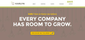
Modern design is becoming cleaner and simpler all the time. Leaving empty space around elements is an important aspect of design for a clean, clear site.
Navigation – The user always needs to have clear indications of how to travel around your site. The main navigation should look the same on every page and be in the same location for easy access.
About Us
Google analytics confirms that the About Us page receives a lot of attention from visitors. Don’t leave out this critical information for visitors who really want to know who they are dealing with.
Contact
Curious people want to know where you are, these pages provide a consistent place for visitors to get directions and other contact info. Nobody likes searching for your contact info so hand it over on a platter – the contact page.
Call to Action
The latest buzzword for sites but what does it mean? In simple terms, it just means making sure that you define what it is you want the user to do and then help them achieve that action. If you are hoping they will call your business then ask them to do so and provide the phone number or an auto-call function. Many companies with online services have clear content leading to a big, bold “SIGNUP” or “TRY FOR FREE” type of Call to Action. Sophisticated businesses may have a less obvious action to encourage but still benefit from thinking out the process.


