We all know great design when we see it but creating great design takes talent and practice. Adobe Illustrator is a powerful tool for creating graphics for your site but it also has a very steep learning curve. Recently, I began using an online graphic design tool, CANVA.COM, to create simple graphics and my impression so far is that it is easy and fun. Canva is the creation of Guy Kawasaki, a former evangelist of Apple and Motorola. Guy presented at Hubspot’s INBOUND 2015 and was a relaxed and amusing presence. He has a Twitter account that seems to post thousands of tweets a week, keeping a small cadre of graphic designers busy just to keep up. I immediately checked out Canva and much to my delight it really does simplify the graphic design process in many ways.
First, you select your platform and began working in a pre-formatted canvas. Every type of social media canvas is represented including posters and infographics. You then choose elements for background, text, etc. Canva is very flexible in allowing you to upload your own elements or choose from free and $1 canva elements. The text elements are pre-designed elements, just waiting for you to drop in your text. In this image, I used a photo of mine from Rock Harbor Cape Cod and a Canva text element. While it looks simple, that circular pattern is not easy to create from scratch. The proportion of design elements is already determined allowing for modern and clean balance…

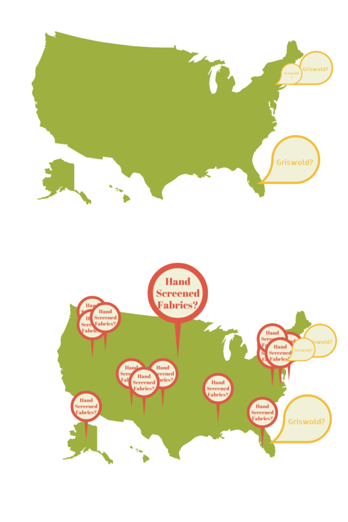
I often struggle to collect professional photos from companies that represent products, locations, staff. One excellent, professional photo can do a lot of heavy lifting on a site, presenting brand and other messaging with ease. One of the freeing aspects of Canva is that you learn you can create infographics, postings, and headers using many other sources for backgrounds. While these may not be appropriate for main site images they are really useful for social media and other quick turnaround channels. Twitter posts with a great, but not site-specific, image are very captivating when done with attention to layout. Canva text is pre-designed for appeal with font details carefully determined. Here is an infographic I had fun with, it illustrates the difference between just brand traffic and great search traffic.

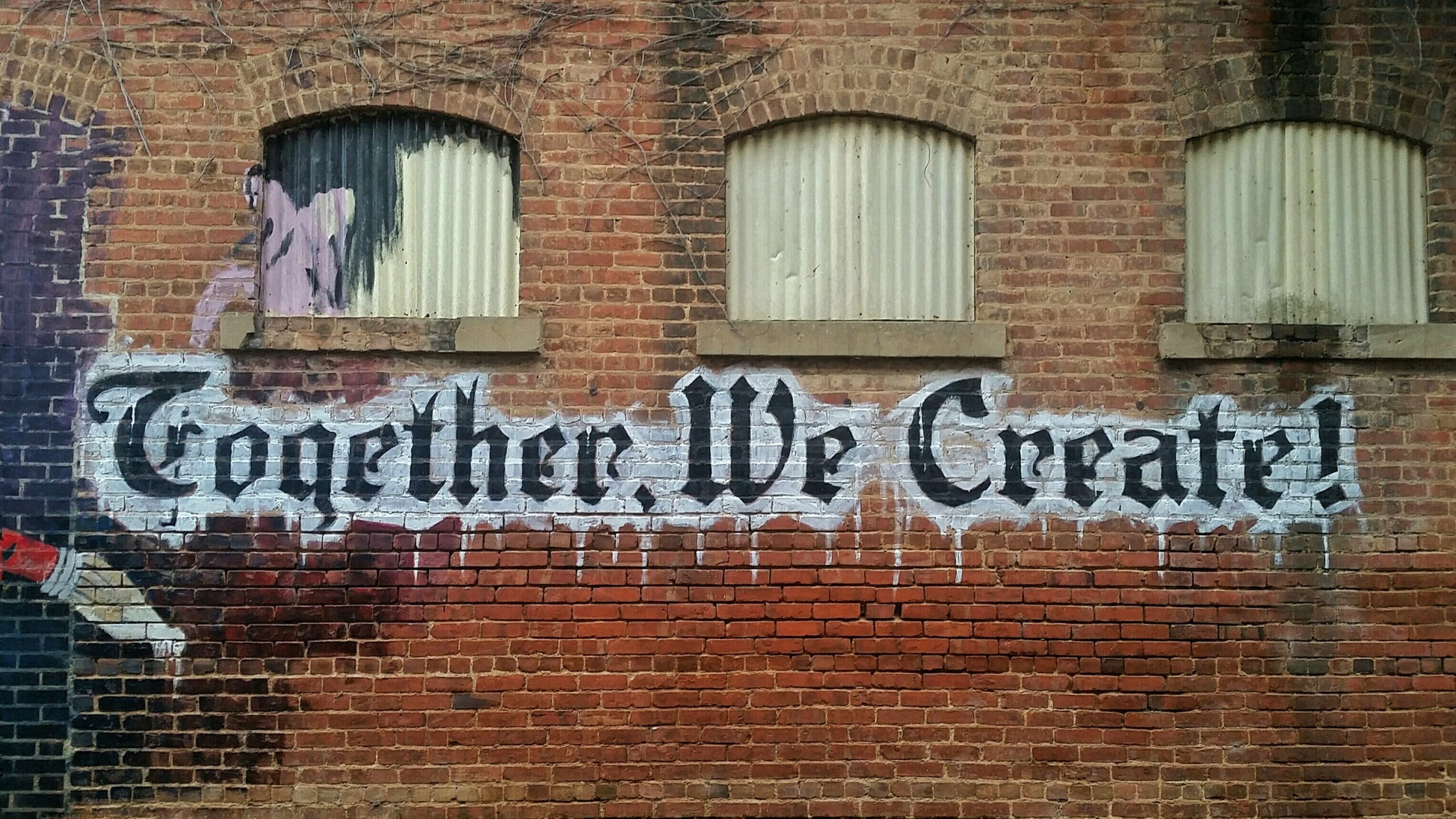
Combined with a source of free images, such as UNSPLASH.com, you can really create some high-level looks in a flash. Here is a UNSPLASH city scene and Canva graphics, basic of course but also lightning fast… and free! No monthly SAS fees, no expensive content purchases. The text design components are just where they should be.


