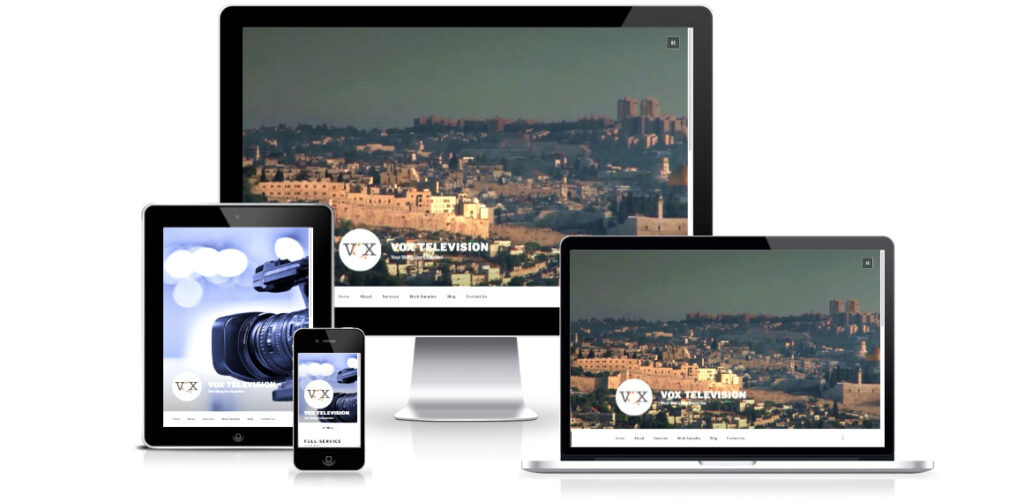
Each year WordPress develops a new, default, theme to incorporate new ideas on-site layout, use, and features. The Twenty Seventeen theme represents a focus on creating company websites in addition to a blogging platform.
Twenty Seventeen brings your site to life with header video and immersive featured images. With a focus on business sites, it features multiple sections on the front page as well as widgets, navigation and social menus, a logo, and more. Personalize its asymmetrical grid with a custom color scheme and showcase your multimedia content with post formats. The default theme for 2017 works great in many languages, for any abilities, and on any device.
The theme is spaciously laid out, it’s very modern but might be too sparse for some designs. There is so much white space that there are a lot of customizations for reducing white space by reducing padding, increasing the font size, adding full-width pages.
I recently used Twenty Seventeen to assist VOX Television with a new site. A rapid deployment to create a space for a busy production team. The theme is beautifully responsive. On widescreen the video loops and for mobile or smaller responsive screens a backup image is displayed.
I added a template for a full-width page, some CSS to alter styles. I’ll also add a blog excerpt code change as the theme out of the box shows the entire post all of the time, for long posts that you want to skip that can be cumbersome.
All in all, this theme is pretty great. After using some very shortcode-heavy themes I can really appreciate a corporate theme with simplicity and beauty.


